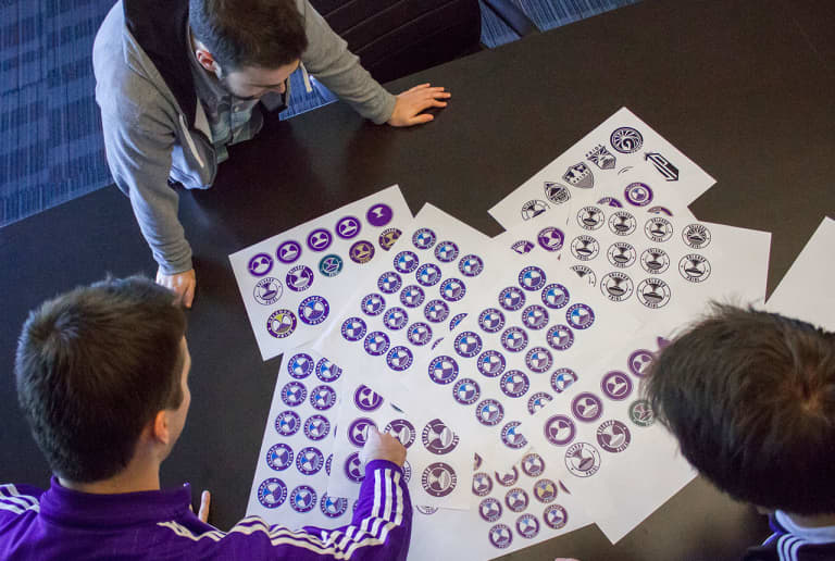
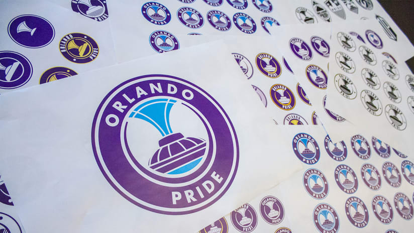
The Orlando City marketing crew had a big decision to make. Sitting on the table in front of them were over ten different logos that were narrowed down over the span of the previous month. One of the logos would represent Orlando’s newest sports team, the Orlando Pride. After intense collaboration, they chose a logo they believed would best represent the Club and the City.
The Orlando Pride logo is based upon the fountain at Lake Eola, a landmark familiar to all residents of Central Florida. The logo features the colors City Purple, which represents the Orlando City soccer culture, and Eola Blue which represents the water geyser at Lake Eola and the chain of lakes known to Central Florida. The logo was created by three members of the Orlando City marketing team, James Pellington, Matt Stone and Eric Allsopp.

Those three members of the marketing crew spent countless hours devoting their time to the creation of the brand. “We wanted this logo to be the pride of the city. The fountain at Lake Eola is one of the most recognizable icons in Central Florida,” stated Pellington, Orlando City’s brand manager. “We wanted the logo to be clean and simple…The logo needed to be purple, obviously, because that’s who we are. But we also wanted the team to have it’s own identity, and so we wanted the Pride to have their own colors. Water is a big part of Central Florida, we have hundreds of lakes, and so the inclusion of the blue really made sense.”
The decision to make the fountain at Lake Eola the foundation of the logo did not come easily. The marketing crew spent over a month designing over 40 different concepts, and 50 iterations of the final logo. “We did a lot of research,” expressed Stone, Orlando City’s graphic designer. “Being close to Lake Eola, the fountain made perfect sense…It is quite refreshing to look at, and very iconic.”
The crew made sure that every idea and concept was discussed and researched. Collaboration was a necessity to make sure that the final version of the logo was not only aesthetically pleasing, but made sense overall. “We put in a lot of hours of research,” asserted Graphic Designer Eric Allsopp.
“We looked at other logos in the league, and we looked at other logos around the world. We wanted to see how other teams and other clubs represented their own brand and their own pride, what we liked and what we didn’t. We took some of those ideas as inspiration, but ultimately we came up with something that we feel fits our Club and our city.”
The marketing crew’s determination and willingness to make sure that the logo chosen was the absolute best option didn’t go unnoticed. Vice President of Marketing, Teresa Tatlonghari was impressed with the effort. “James, Matt, and Eric all did a fantastic job. They spent countless hours researching all possible options for this logo. I believe they found the true essence of Orlando Pride.”


